Work
Contact
Work
Contact
Bespoke Wellness
You may also like
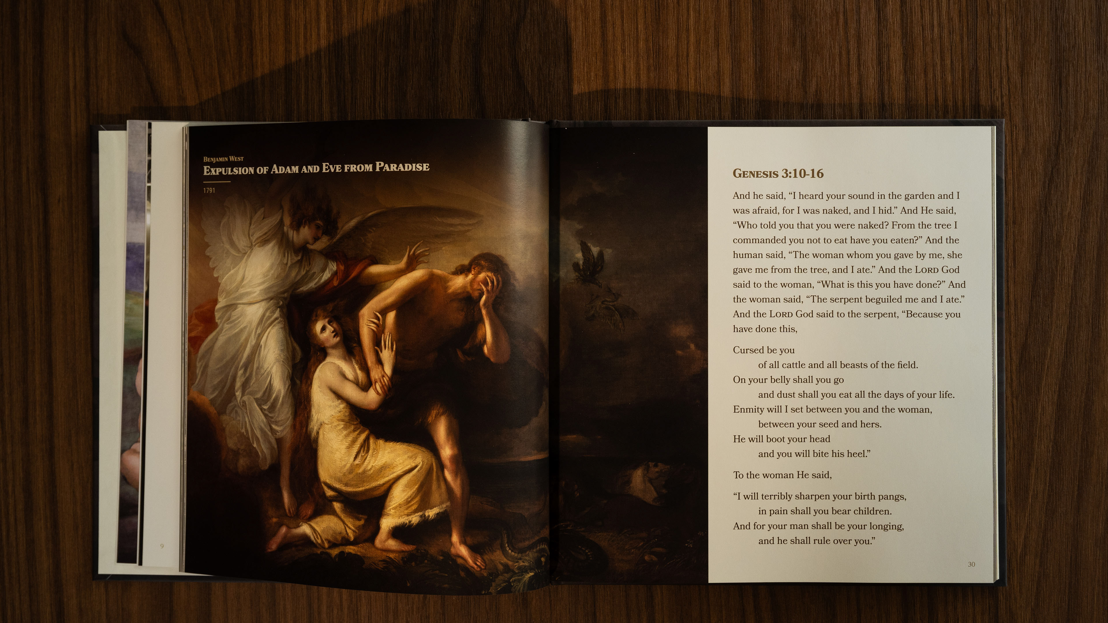
Exclusive Donor Premium Book
2023
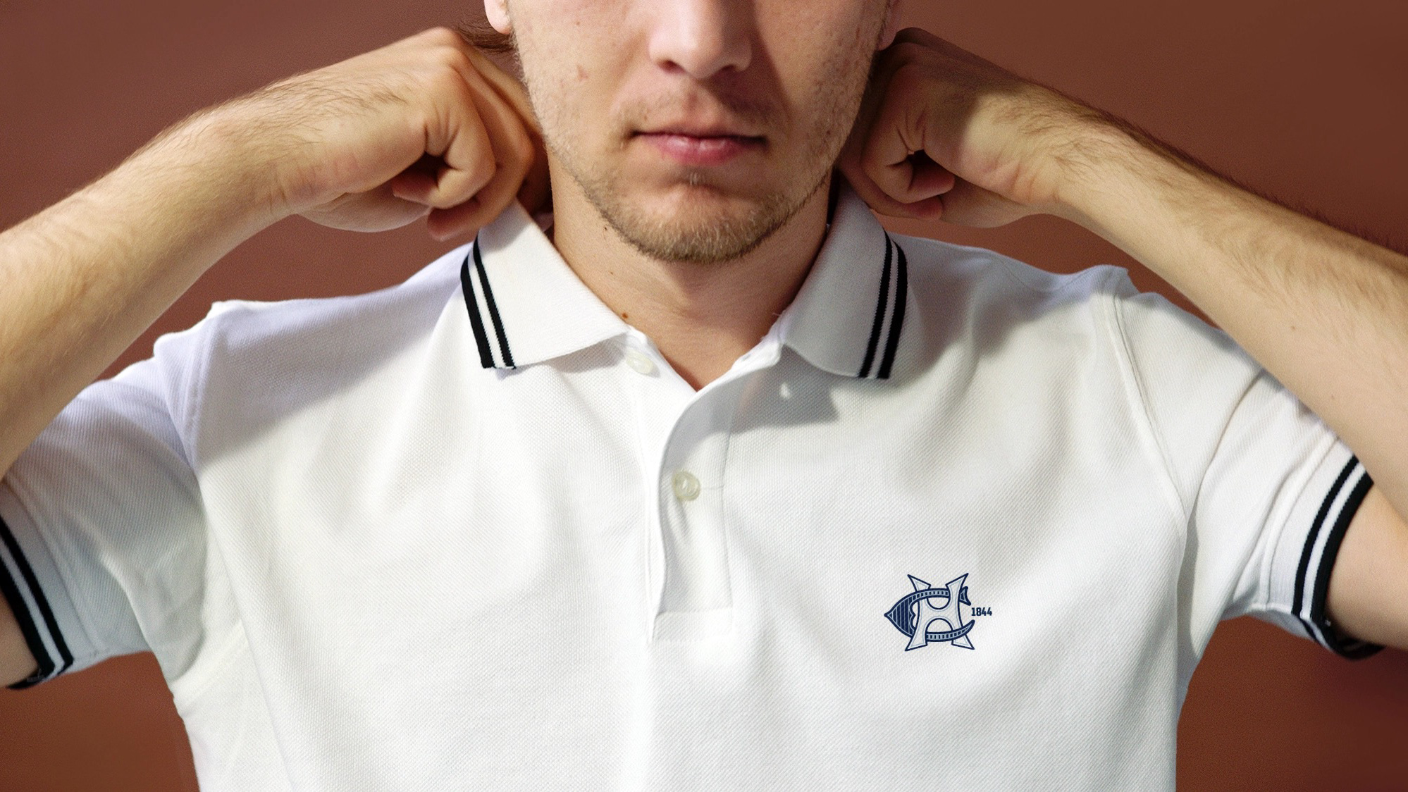
Apparel
2025
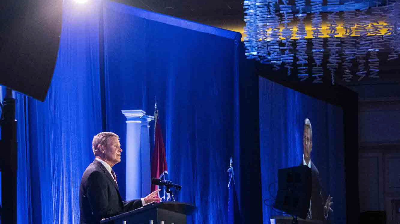
Event & Speech Photography
2025
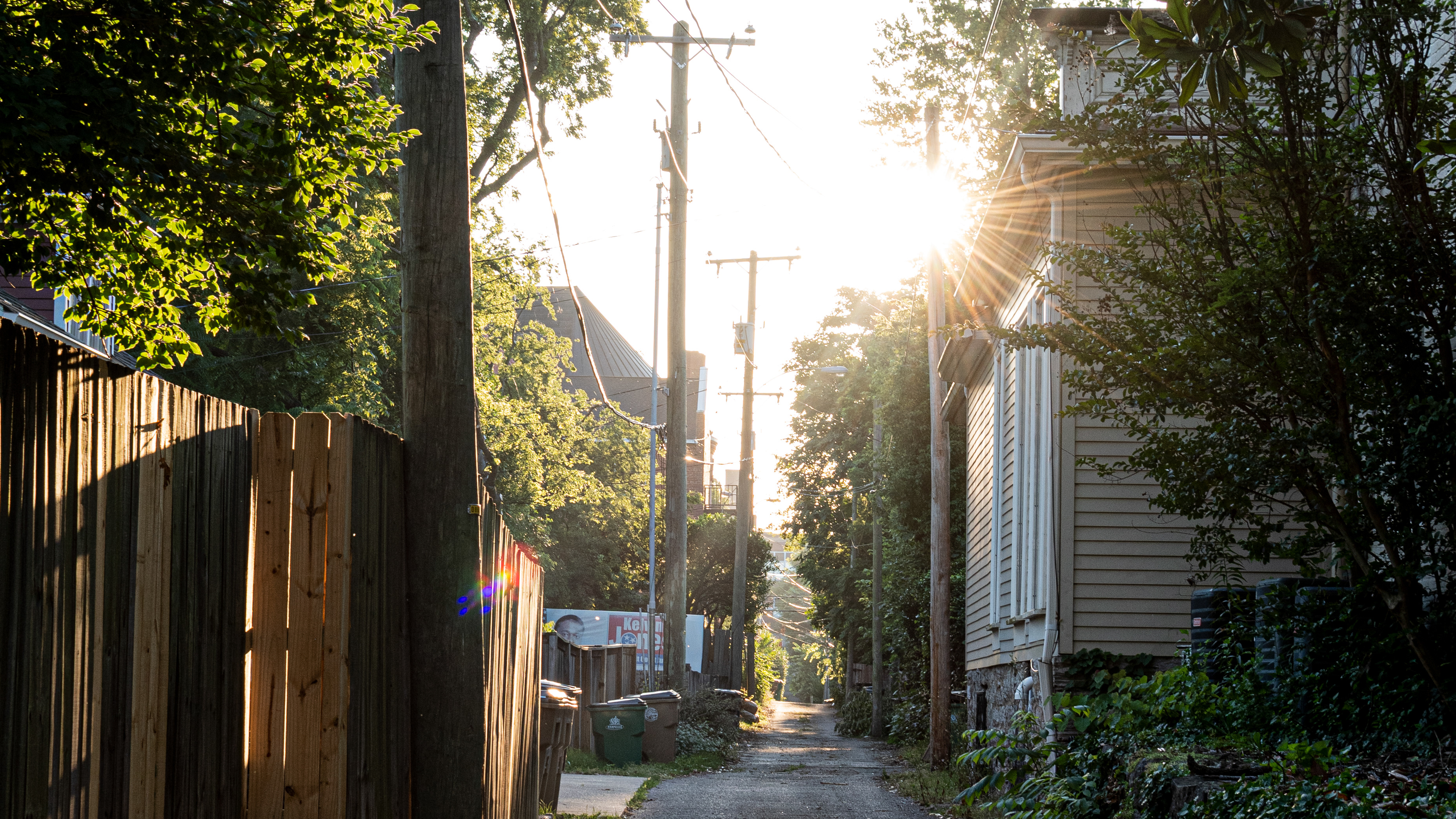
East Nashville After the Tornado
2020
High-End Holiday Event Branding
2025
Education Conference Materials
2025
Posters
2025
↑
Back to Top
Ok with a cookie?
Sure!
No thanks