
These projects represent a series of premium, long-form educational products designed to accompany online courses and serve as tangible donor thank-you materials. Rather than duplicating digital content, the books were conceived as enduring physical artifacts—objects meant to be kept, referenced, and valued over time.
Originally developed as a complementary experiment, the success of the initial publications helped establish a durable model that continues to be refined and produced for new courses.
Role: Lead Designer
Scope: Premium product design, editorial systems, typography, layout, print production
Context: Online course companions and donor stewardship materials
Scope: Premium product design, editorial systems, typography, layout, print production
Context: Online course companions and donor stewardship materials
The challenge was to design physical publications that felt meaningful in an increasingly digital ecosystem. As companions to online courses—and as donor premiums—the books needed to communicate value without replacing or duplicating the digital experience.
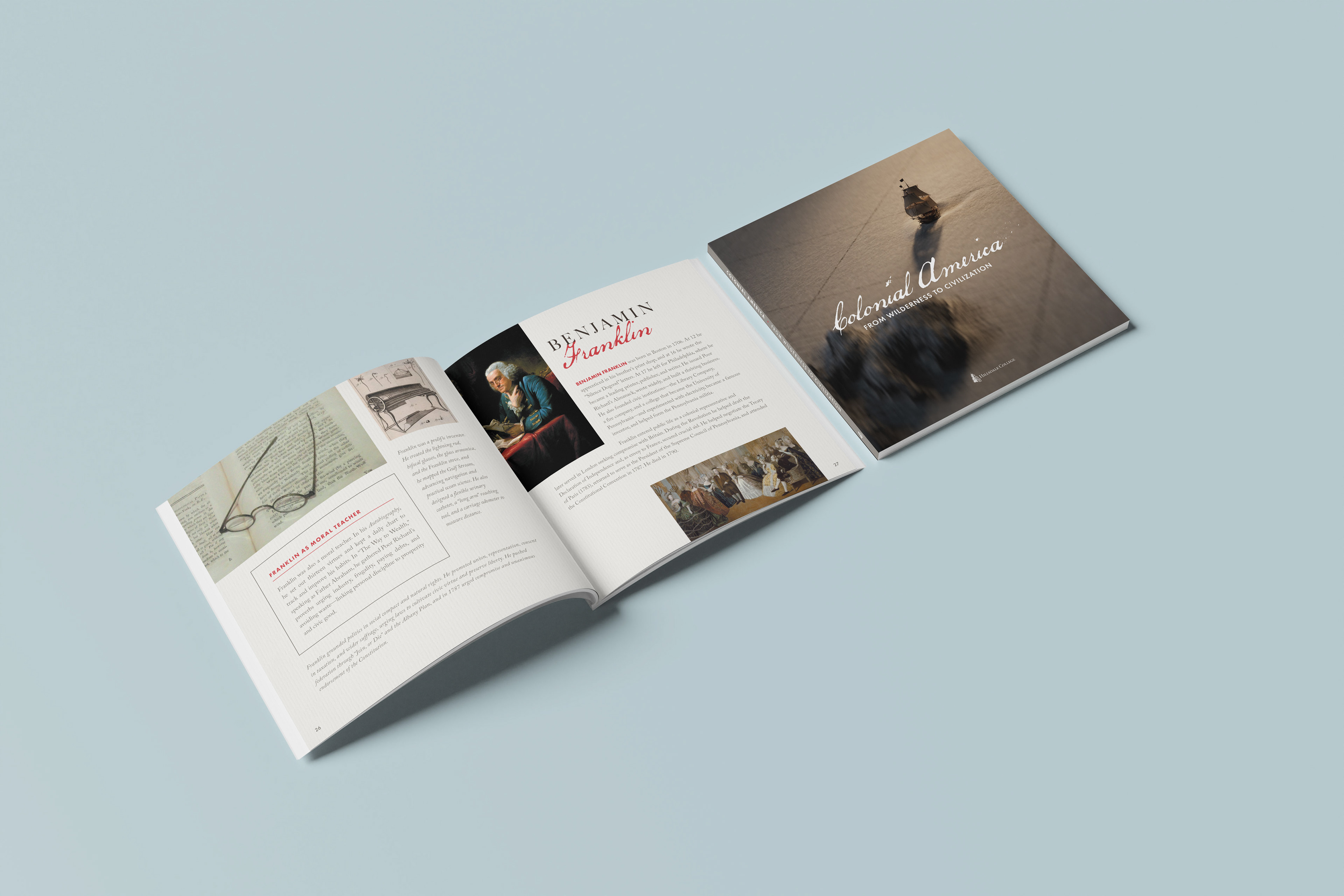
Front Cover and Interior Spread of Colonial America: From Wilderness to Civilization, Released Winter 2025/26
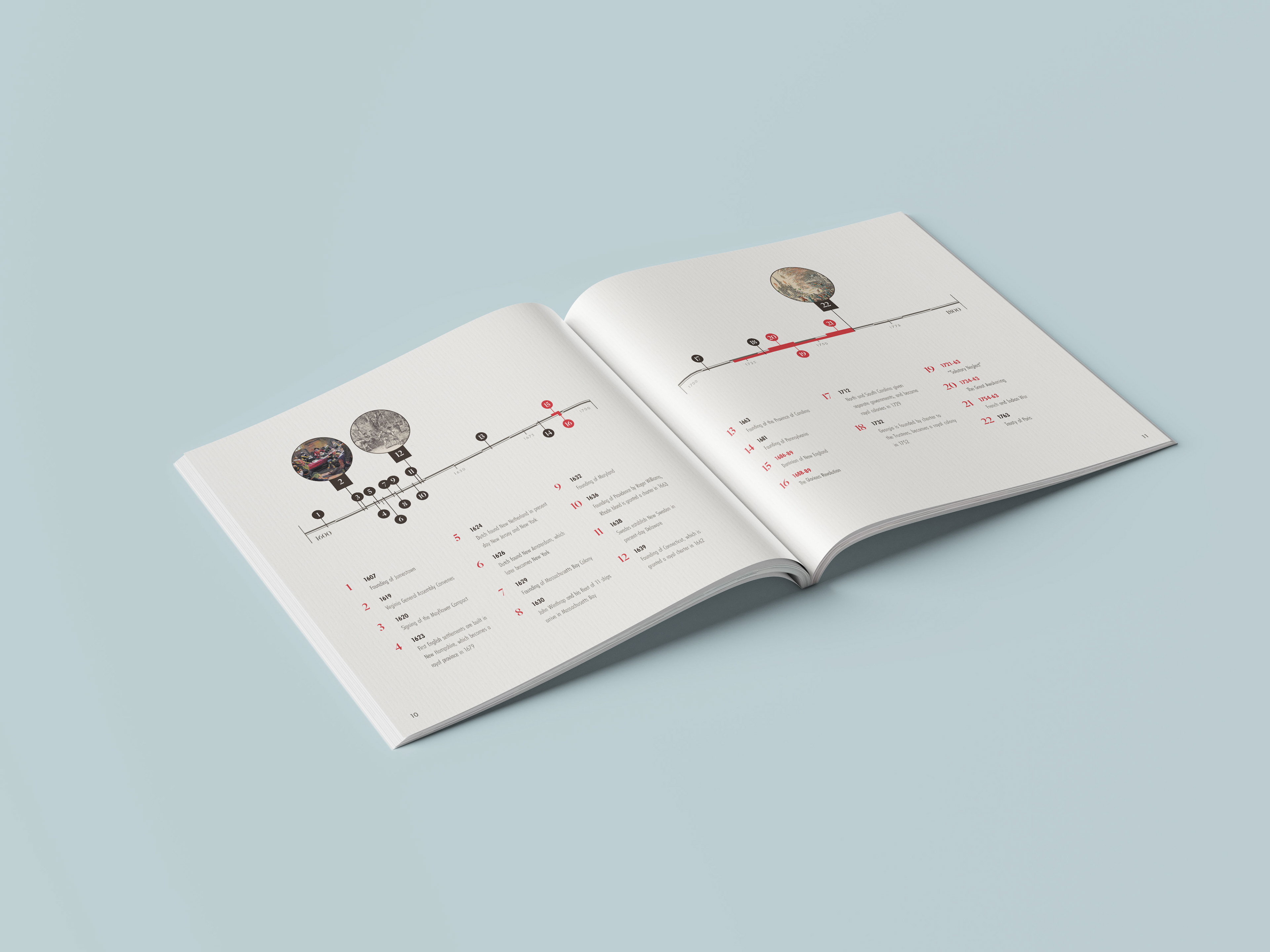
Colonial America: Flexible, bespoke timeline system spanning 200 years, designed to accommodate overlapping events and reused across the primary timeline and six additional instances throughout the book.
They needed to feel:
Substantial, not promotional
Educational, not disposable
Premium, not ornamental
Educational, not disposable
Premium, not ornamental
Most importantly, they needed to justify their continued existence as physical objects.
Objective: Create book-worthy products that feel intentional, lasting, and worth keeping.
Support long-form reading and reference use
Balance educational clarity with perceived value
Maintain consistency across disparate subject matter
Avoid trend-driven design that would quickly date the work
Design objects worthy of retention, not disposal.Balance educational clarity with perceived value
Maintain consistency across disparate subject matter
Avoid trend-driven design that would quickly date the work
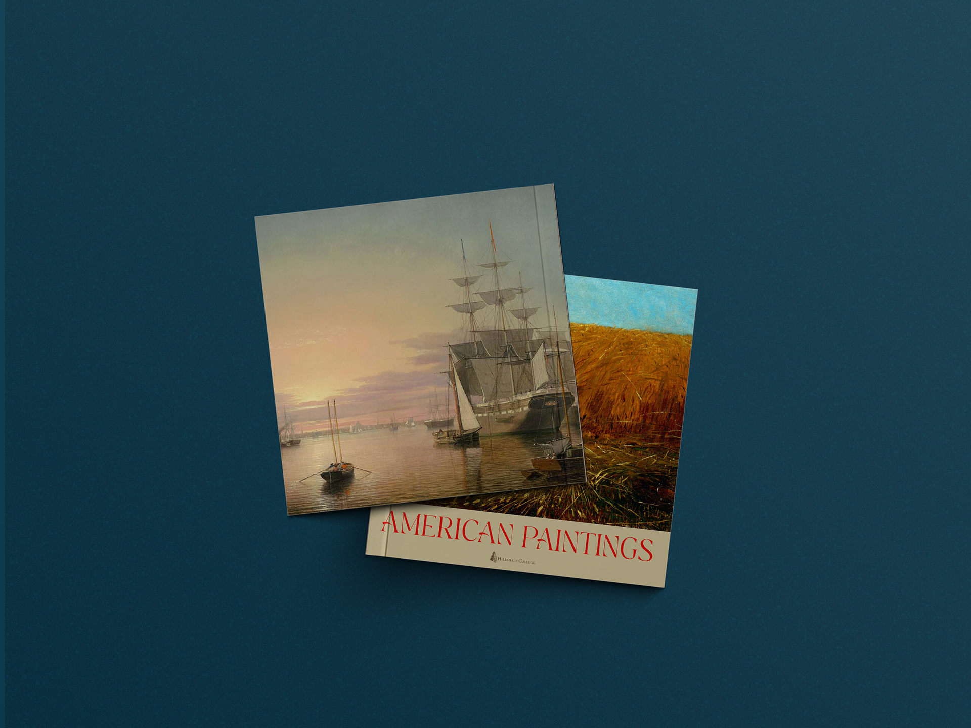
American Paintings. Left: back cover. Right: front cover.
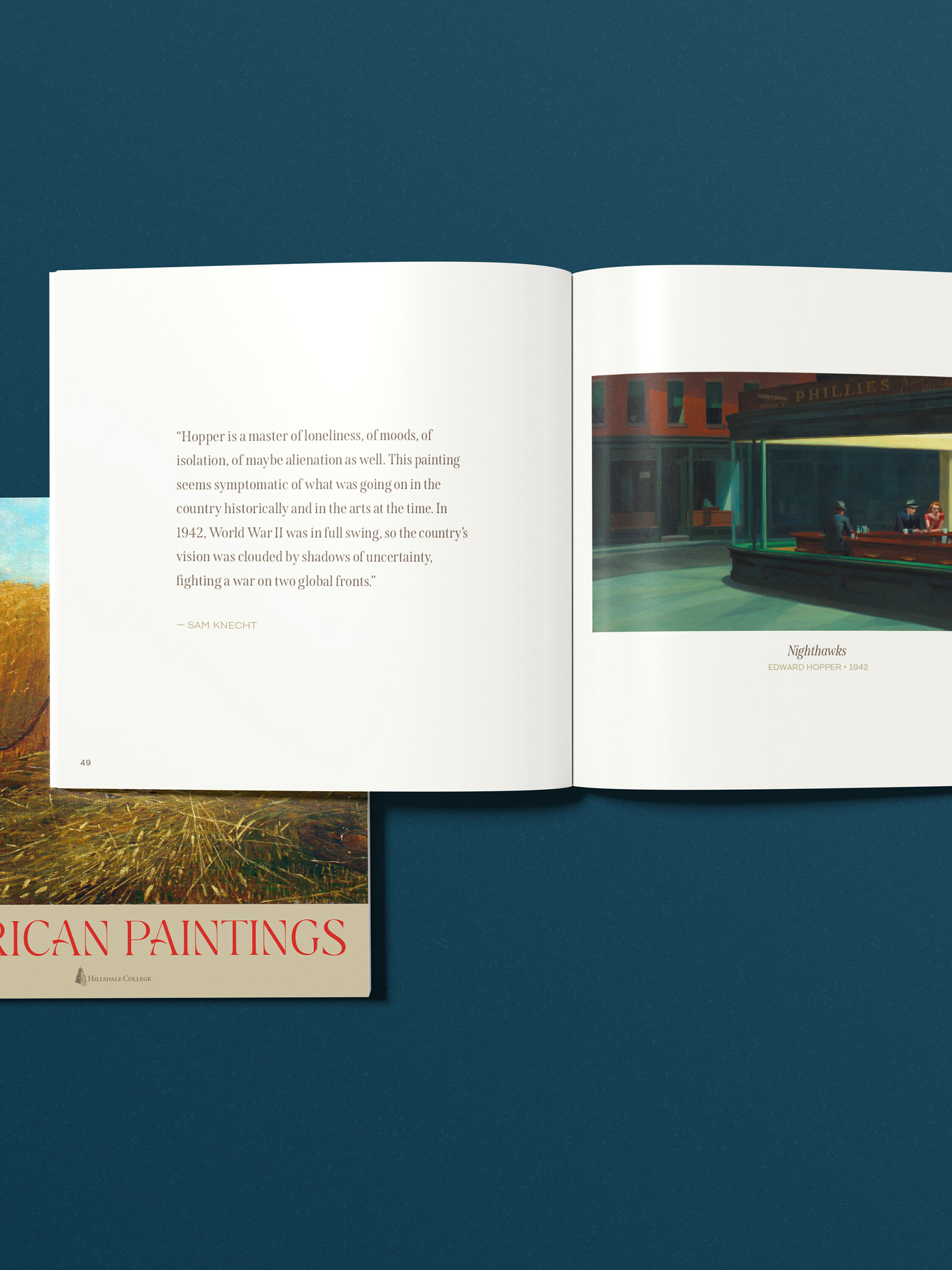
Edward Hopper painting displayed next to Professor Knecht's commentary.
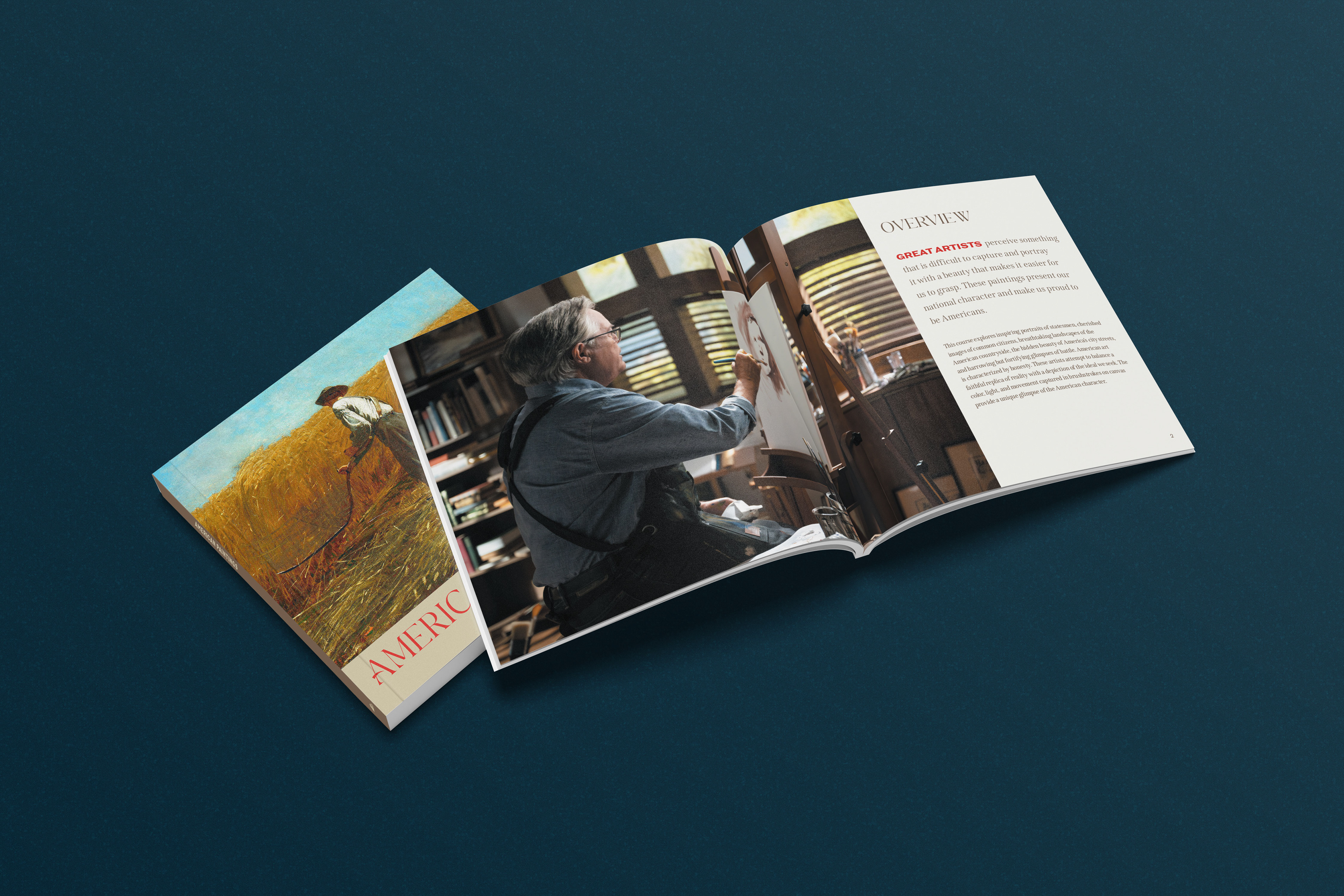
Front cover and Overview spread, featuring professional photograph of course instructor Sam Knecht taken on-set of the American Paintings course.
Rather than enforcing a single visual style across every title, the work focused on establishing shared principles rather than uniform aesthetics.
Each book was designed in direct response to its subject matter—allowing tone, pacing, and visual language to shift where appropriate—while maintaining a consistent standard of clarity, restraint, and editorial rigor.
This approach ensured that no book felt generic, templated, or visually mismatched to its content, while still operating within a coherent design philosophy.
While the books differ visually, they share a common editorial foundation.
Typography was selected for extended reading and instructional clarity. Layout decisions prioritized hierarchy, pacing, and navigability—supporting both linear reading and reference use. Design choices favored calm, deliberate composition over decorative consistency.
The result is not a visual series, but a family of products unified by intent rather than appearance.
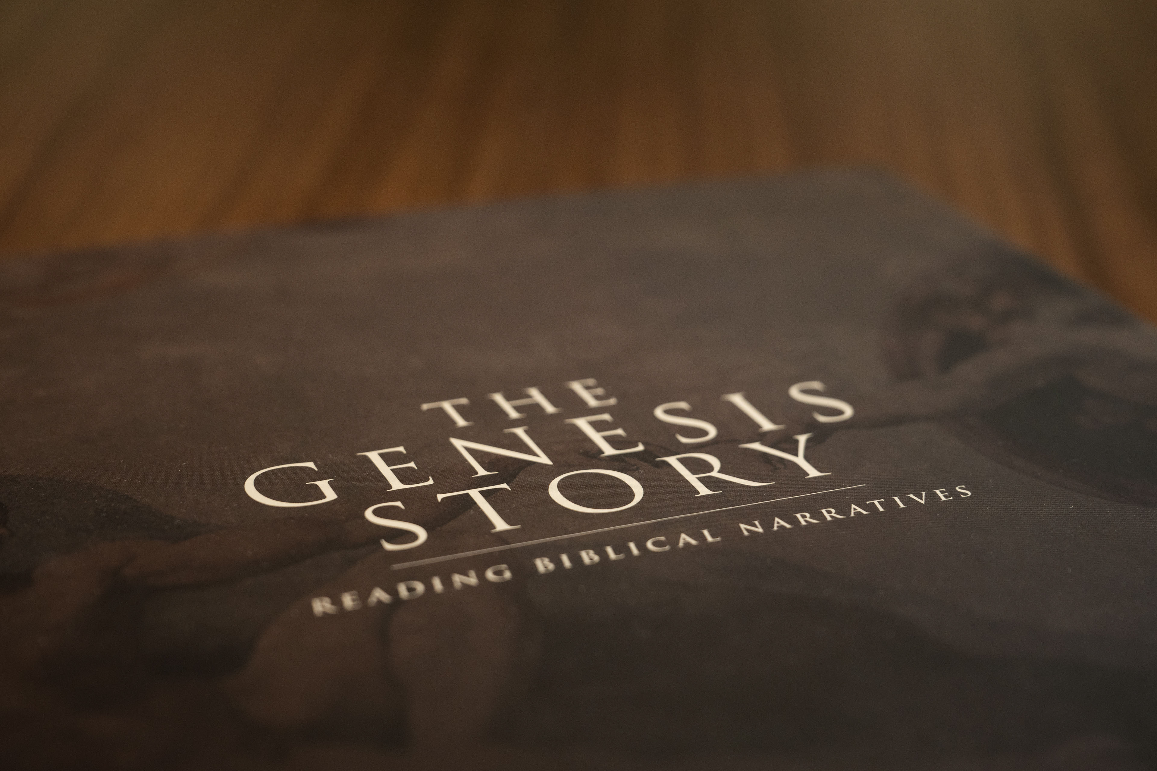
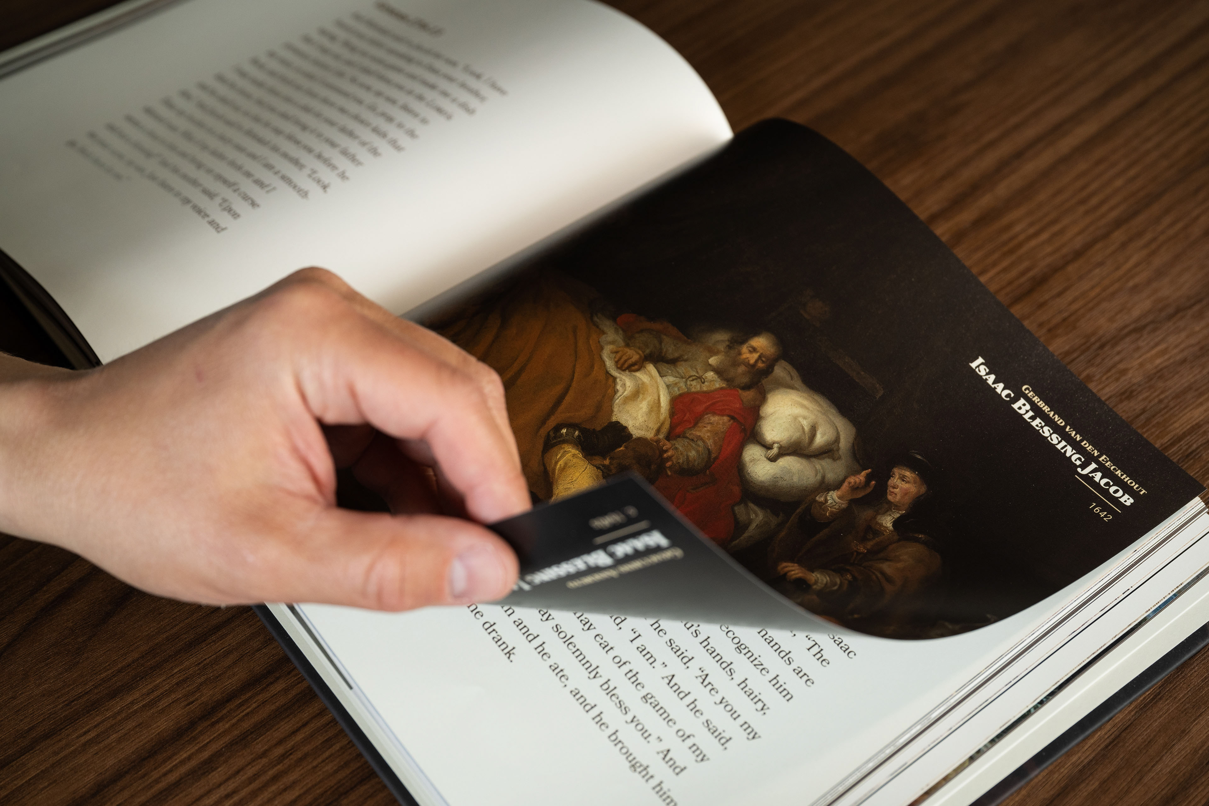
The Genesis Story: Reading Biblical Narratives - Front Cover Closeup
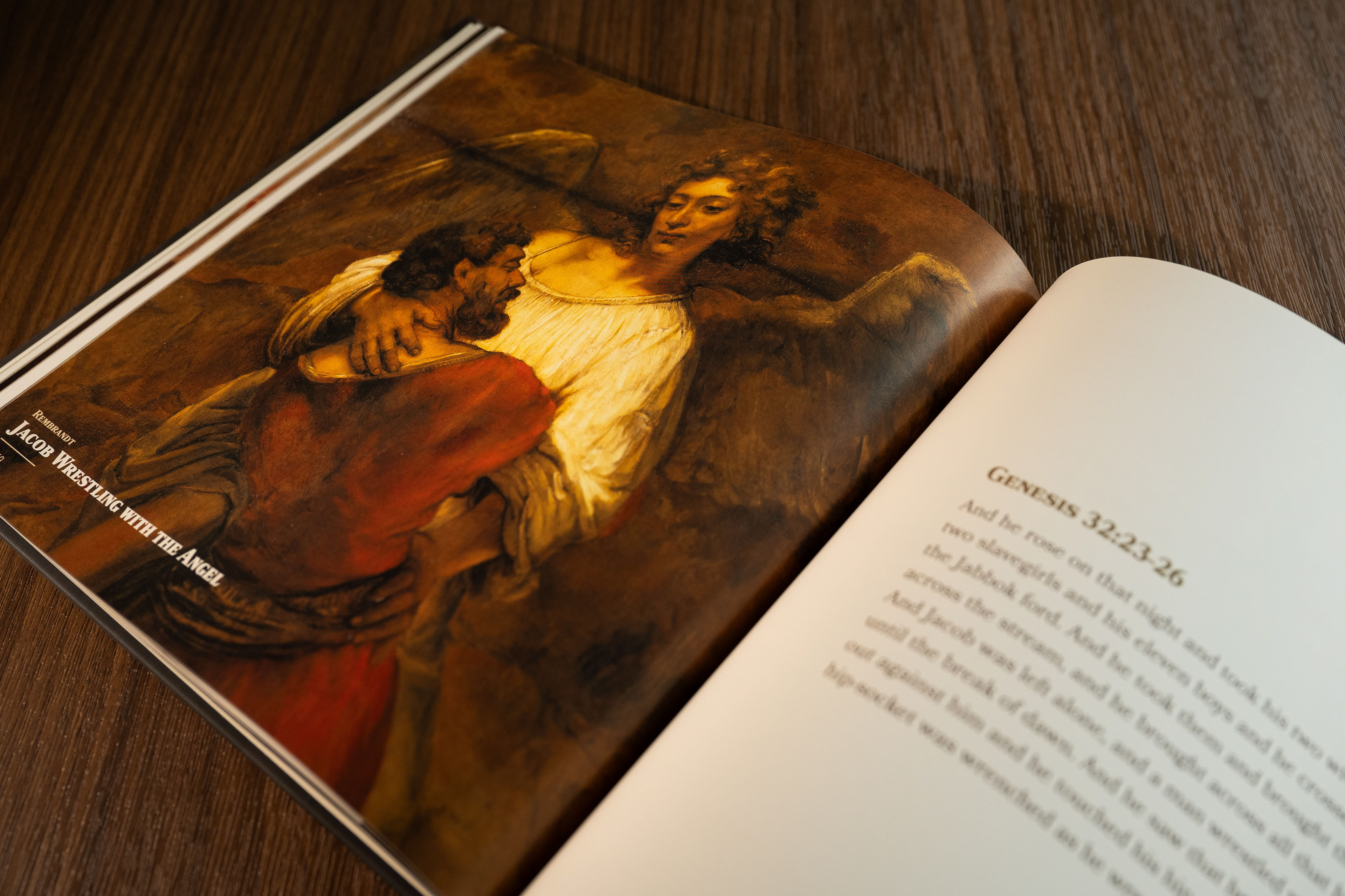
Jacob Wrestling with The Angel by Rembrandt displayed beside passage from Genesis 32.
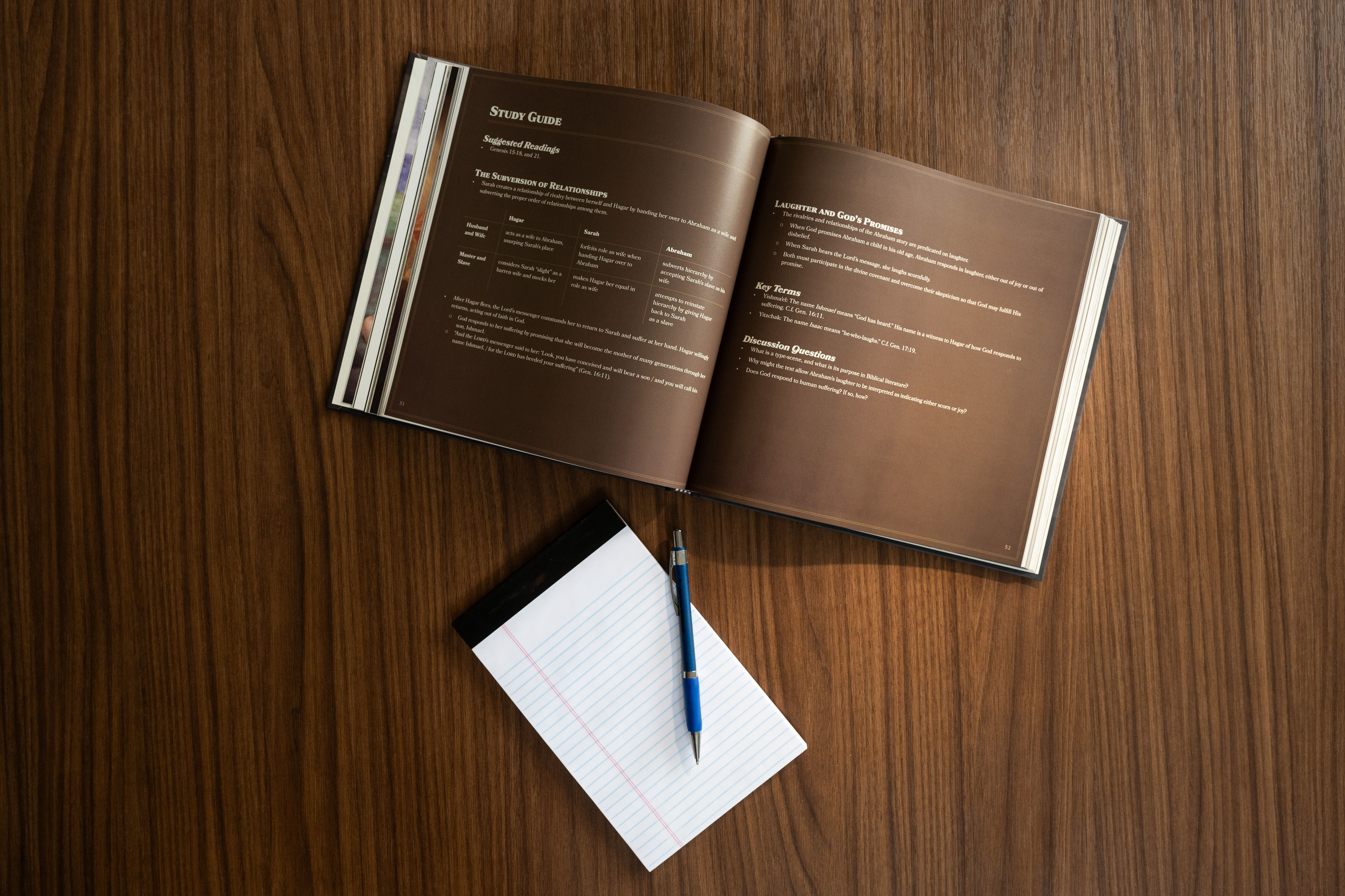
Study Guide
These publications were designed to live alongside digital experiences, not mirror them. Their value comes from qualities the screen cannot provide: physical presence, permanence, and a sense of care.
As donor premiums, the books function as tangible expressions of appreciation—an added value rather than a substitute for digital access. Their physicality reinforces the significance of the gift while extending the educational mission beyond the screen.
Because these books were intended to endure, decisions consistently favored long-term usefulness over short-term cohesion.
—Designed each title to suit its subject matter
—Prioritized readability, clarity, and durability
—Avoided trend-driven visual motifsMaintained editorial discipline without aesthetic uniformity
—Prioritized readability, clarity, and durability
—Avoided trend-driven visual motifsMaintained editorial discipline without aesthetic uniformity
What began as individual publications evolved into a repeatable approach. The continued creation of new books for future courses reflects confidence in the underlying design principles rather than reliance on a fixed visual system.
Their persistence is the result of usefulness and trust—not sameness.